Modernizing the UI for a 10,000-User Platform


Project Index
Introduction
My Role in This Project
Research Phase
Designed 1.0 and We Failed
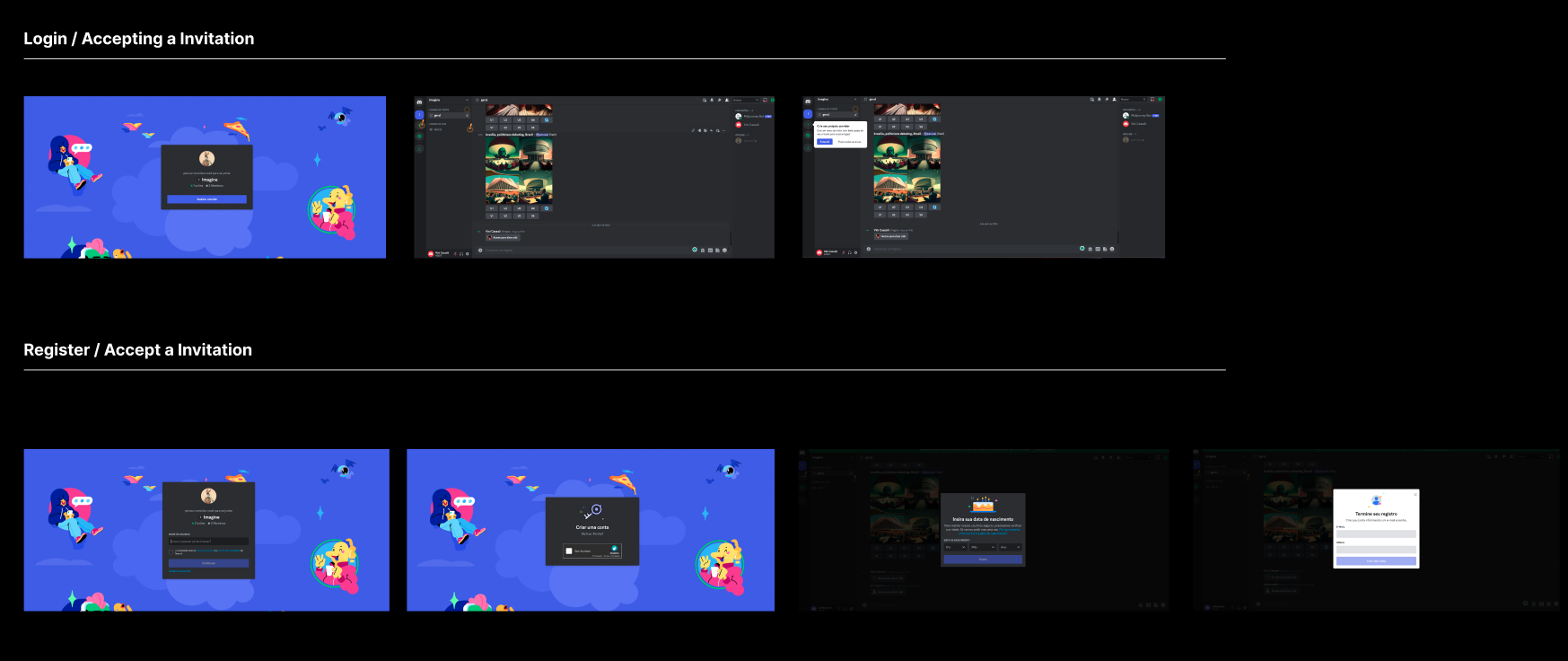
Designed a New Feature: Magicall link
Introduction
Workspace serves as a collaborative hub for organizations and teams, offering features like chat, meetings, and file sharing.
It's important to note that this platform doesn't directly compete with OTT platforms such as Zoom, Skype, or Slack. Instead, ECT packages it for telecom companies to provide to their customers and for internal use within the telecom organization.


This is the old interface of Workspace.
Why This Project Exist?
ECT's design team had numerous features in mind, but rather than implementing a multitude of small ones, management opted for a complete interface redesign and the introduction of these features on a larger scale.
The integration of Workspace became imperative when the design team discovered that company admins using Workspace lacked consistent branding across their respective workspaces.
My role in this project 👩🏼🚒


My role in this project is leading the team and responsible with all the touch points, from the admin page to the main user interface such as call page, chat page, schedule page.
There are times as well that I need to build a component from the scratch and work collaboratively with the Design System Designer.
Discovery Phase
In this stage, our design team has taken a pragmatic approach. We are delving into the intricacies of the user flow, commencing with the company admin inviting the initial Workspace User Admin. This Admin, in turn, begins crafting teams and adding new users within their respective organizations.


The Challenge - We have limited access to the end user 😣
Our initial challenge lies in the fact that we have limited direct access to the end-users of this platform. Typically, ECT markets this product to Customer Service Providers (CSP), who then offer it to their own customers. Luckily enough, we received some insights about end-user behaviour from the CSP.
This places us in a unique position, necessitating creative strategies to ensure an intuitive and user-friendly experience without direct end-user interaction. So, our solution is to combine all the insights from the CSP and also conducted a user interview with internal ECT employee who barely involve in this project, so they don’t have bias opinion.

We listed all the possible features based on the telco company insights and selecting priority features to be released in the next MVP.


This provides a glimpse into our research process, which involves benchmarking, conducting user interviews, and mapping the current information architecture for potential improvements.
One solution to address our lack of resources for gaining user insights from end-users is that we gathered information internally through user interviews and usability testing with our colleagues from different departments who seldom use the app, such as colleagues from finance or marketing.
Design First Iteration


we did user interviews and we need to improved here and there 🤯
Evaluate Design Features
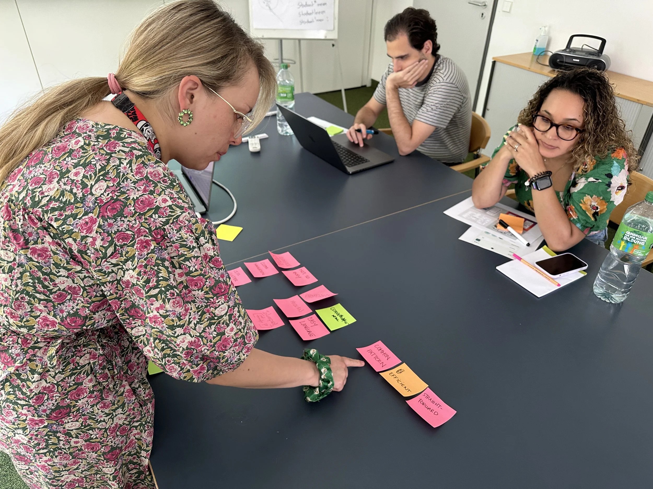
The Design Team doing workshop
The Design Team and I are regrouping for a workshop to evaluate which features or components we can enhance to create a 'wow' factor. We believe that using familiar patterns will reduce cognitive load and make the platform easier to use for all users.
Back to Figma, Refining Wireframes 🤓


Validate My Design Through Usability Testing
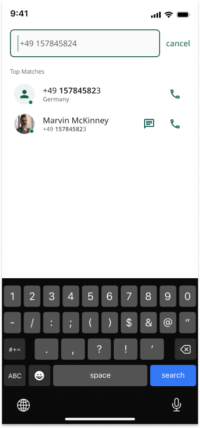
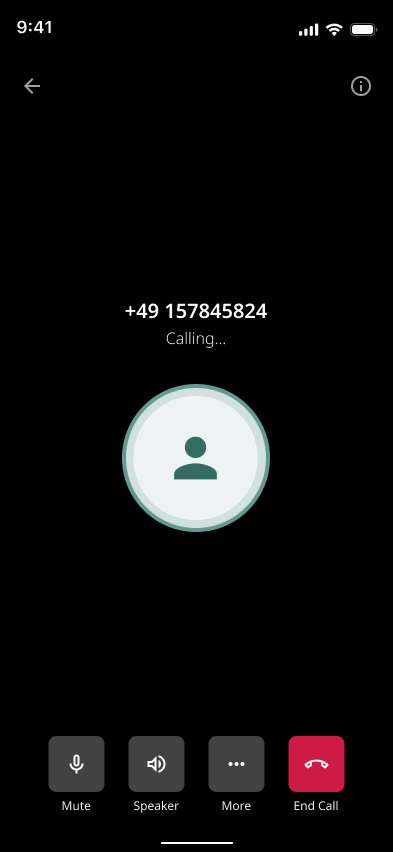
Example: Call Feature “Magicall Link”


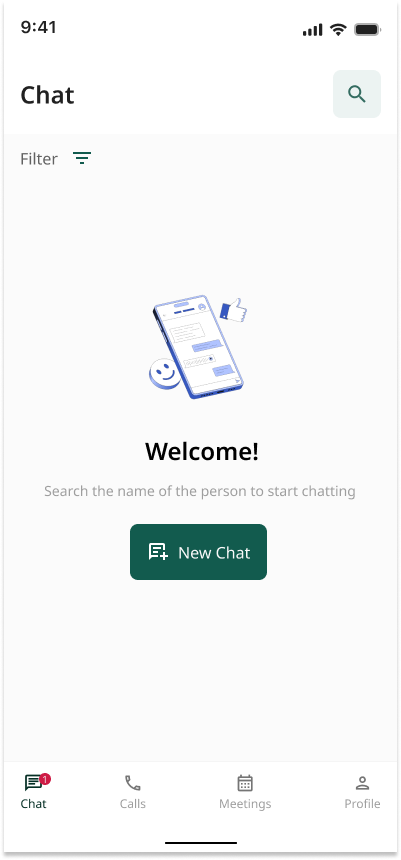
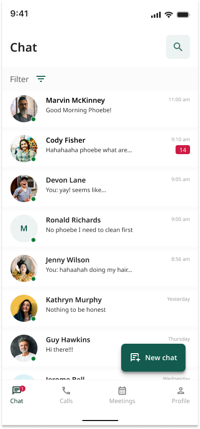
Current State: Mobile Chat